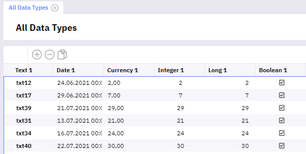
The font used in the grid seems to be bold while standard font for input screens is lighter. The fonts should be same.
EDIT: The grid is correct, it is the text box that has a wrong thickness.
The font used in the grid seems to be bold while standard font for input screens is lighter. The fonts should be same.
EDIT: The grid is correct, it is the text box that has a wrong thickness.
Can you show an example? It seems the same to me
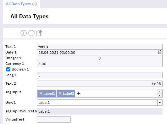
On Retina display I can see a difference even between a single-line and multi-line textboxes.
And the grid uses the thicker font.
So the question is which one is the right one as it seems more that the single-line text box is the one that is too thin as also the label is thicker.
Definitely according to the original design they all should be the same.
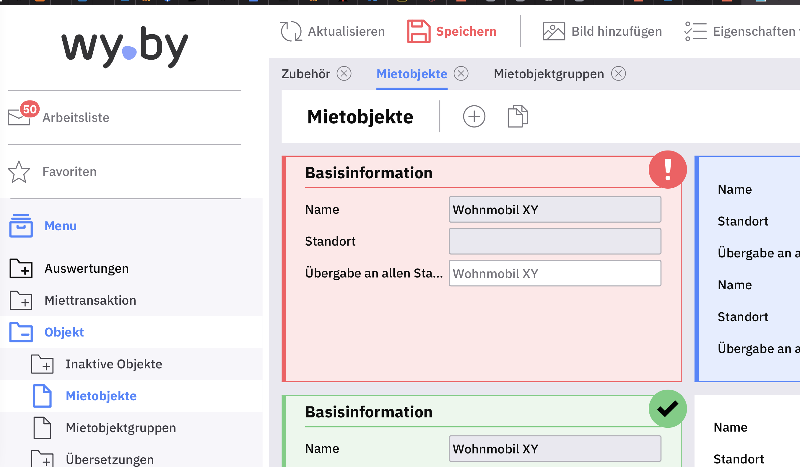
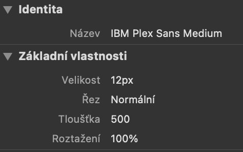
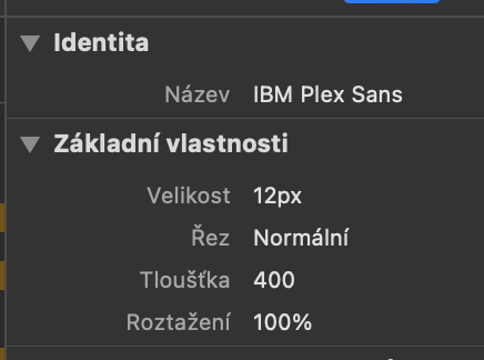
Yep. The single line text box has a thickness 400 instead of 500.
This topic was automatically closed 2 days after the last reply. New replies are no longer allowed.