This how-to will guide you through the process of adding a polymorph field to a screen section. The polymorph field is a special type of the input control, that changes its type (Textbox, ComboBox, CheckBox, etc.) according to the data.
1 - Create Fields in Underlying Entity
The Polymorph field is represented in the entity by a virtual field. Set its DataType property as Object. This will make sure, that when the column is dragged to a screen in the Screen Section Editor, the MultiColumnAdapterFieldWrapper widget will be used.
Polymorph field behaviour is controlled by the content of another field. Such a field has to be defined in the entity as well. There should be also some data fields, where the values will be stored, but they are not necessary to make the polymorph column runnable.
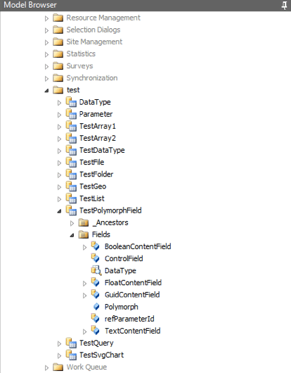
For the sake of the tutorial, let’s define a virtual field Polymorph, the control field will be Lookup Field DataType (creation of Lookup Field is not part of this tutorial) and content columns BooleanContentField, FloatContentField, GuidContentField and TextContentField. Data types of the content columns are discernible from their respective names.
2 - Add MultiColumnAdapterFieldWrapper to a Screen Section
In Screen Section Editor, simply drag the previously defined virtual field to the section area. MultiColumnAdapterFieldWrapper will be added. Set the name of the control field in the ControlMember property. In the case of the tutorial ControlMember property value is DataType. DataType is the control field, which we have defined in the previous step.

3 - Set up Control Constants
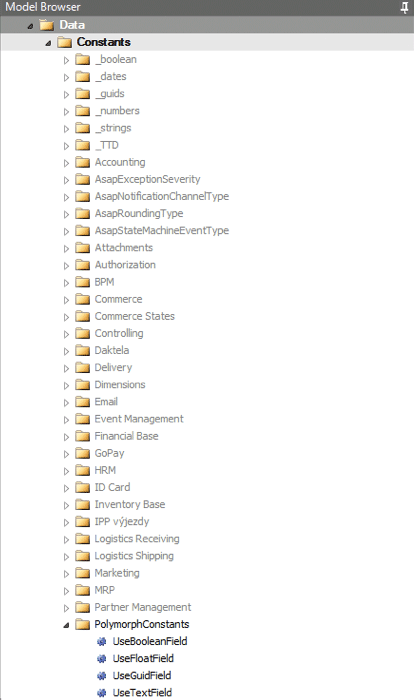
The behaviour of MultiColumnAdapterFieldWrapper is controlled by values in ControlMember. We need to set up these values as constants, that will be referenced in by wrapped input controls. In our case, these constants mirror the possible values of the DataType field. For our example, we have defined constants UseBooleanField, UseFloatField, UseGuidField and UseTextField.
3 - Add Input Controls to the MultiColumnAdapterFieldWrapper
Drag data fields you intend to use to the MultiColumnAdapterField Wrapper. For each input control select a constant and set it in the MappingCondition property. If the control field has such value, this field and input control will be used, otherwise, it won’t be visible. As shown in the illustration, we have assigned the UseTextField constant as MappingCondition for the TextContentField input control.
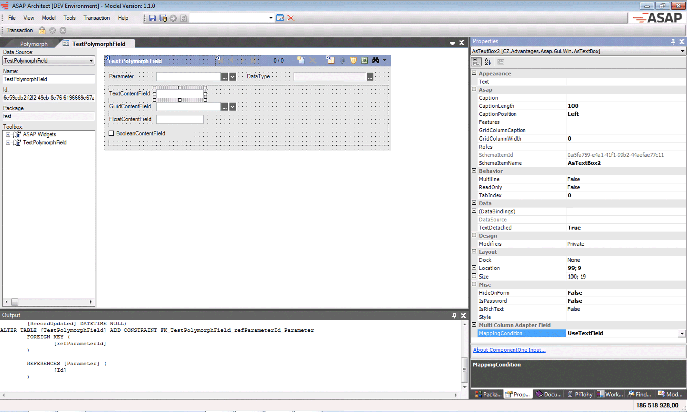
You can drag multiple input controls to the wrapper. Since at maximum, only one input control is supposed to be visible, you can arrange them in a column and the wrapper itself will always set its Y property to the top. The X property is taken from the input control unchanged.