Hi all,
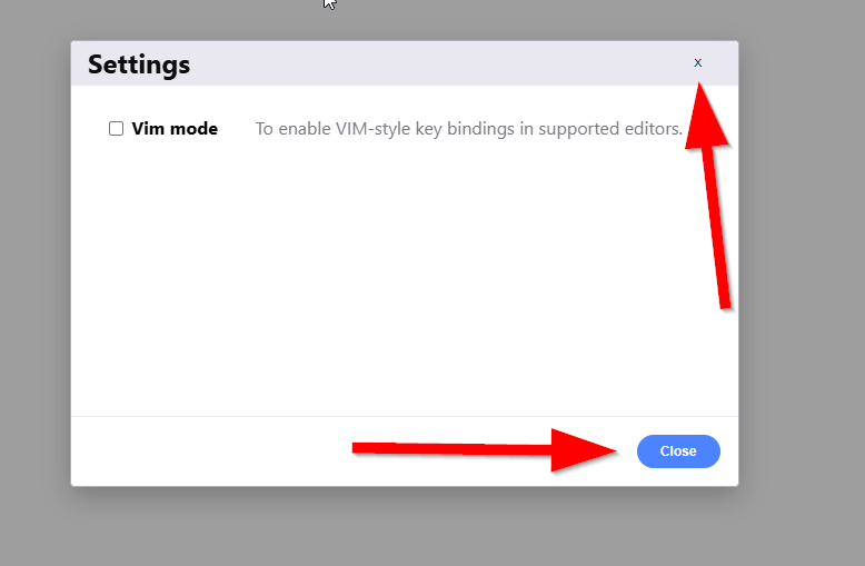
I noticed that the Settings modal in the HTML Architect looks visually out of place compared to the rest of the application. The header bar, the plain “x” close button, and the overall layout don’t match the design language used elsewhere in ORIGAM — it feels like it was dropped in from a different app.
Would it make sense to restyle this modal to match the rest of the application? Consistent styling for dialogs (header, close button, action buttons, spacing) would make the Architect feel more polished and unified.
Screenshot attached for reference.
I’m happy to open a PR for this.
Thanks!