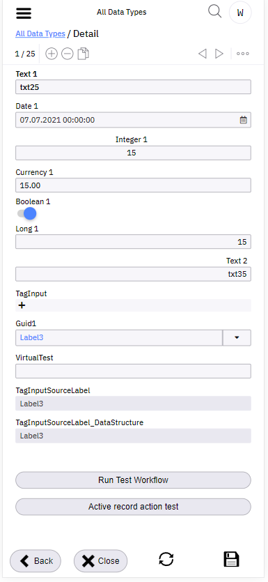
Close button - suggestion to place it on the top.
@david.pochobradsky the top of the screen is already crowded. There is a menu icon, a potentially very long screen title (sometimes spans 2 lines), a dropdown icon (if more than one screen is opened), a search icon and a user icon.
I suggest not to put the close icon to the top. Instead I would change it to a button style with a small cross and a text “Close” and leave it in the bottom.
So there would be two buttons < Back x Close in the bottom of the screen all the time.
What do you think?
Well, yes, it could be, but please consider that it is quite easy in mobile layout to close the screen.
It is not a big problem in classic menu item where you can just open the form and when you close it, it is easy to open it again.
Our use case is Workflow screen and when the user closes the screen, it is not so straight forward to open it again.
This might be solved by:
- If I can set dirty flag before the screen is opened (current behaviour is that the screen does not have a dirty flag when it is opened). This might be also useful general function for other use cases.
- Or inside workflow always ask whether user wants to close the screen.
I personally would prefer the first option becuase it might be useful for use case such as CREATE new record and display SAVE button in red color. And when the user wants to close screen, the application asks for confirmation (current functionality).
There is already a request for this even on desktop. It is the case on workflows where the user enters lots of data and then clicks on x by mistake and everything is gone immediately.
It’s a good idea with the dirty flag though but we do not have it in workflows as there is the Next button.
I think we should always ask if the Next button is visible.
A post was split to a new topic: How to force dirty state of screen before the form is loaded
@david.pochobradsky Can we consider this task done?