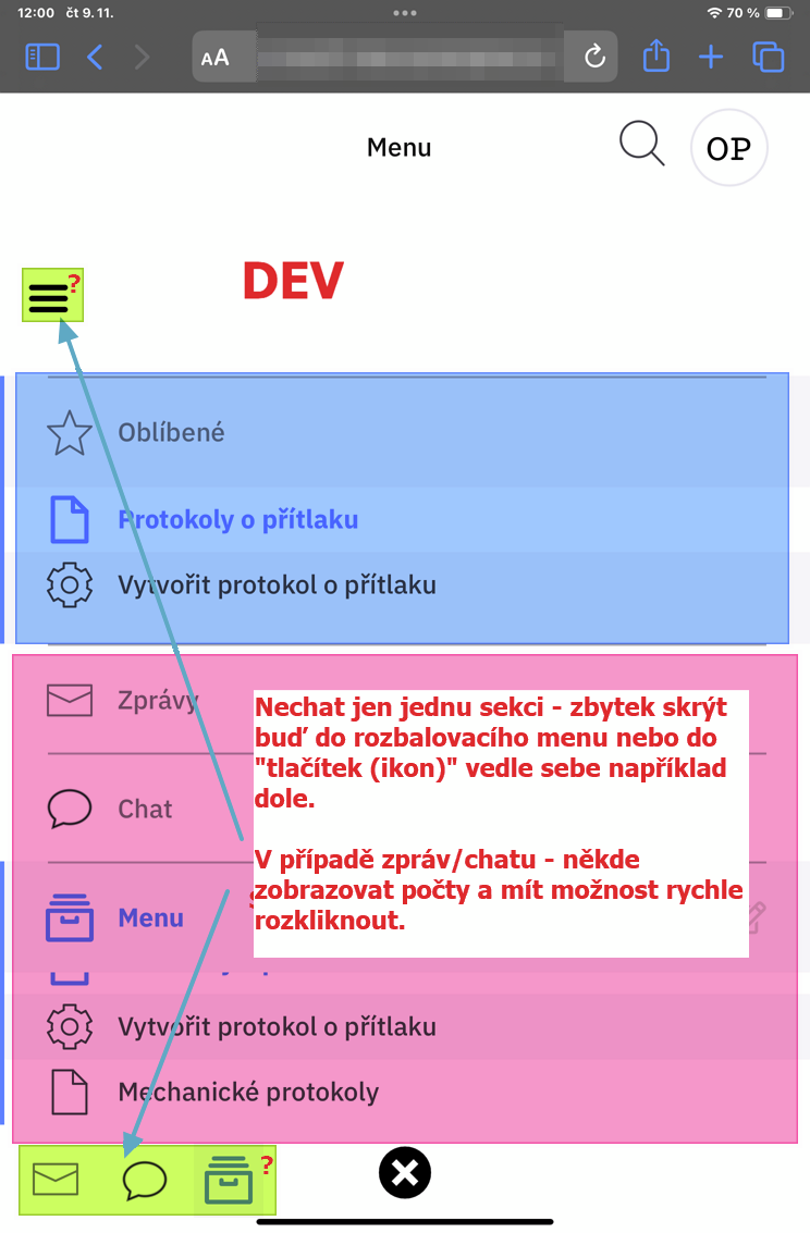
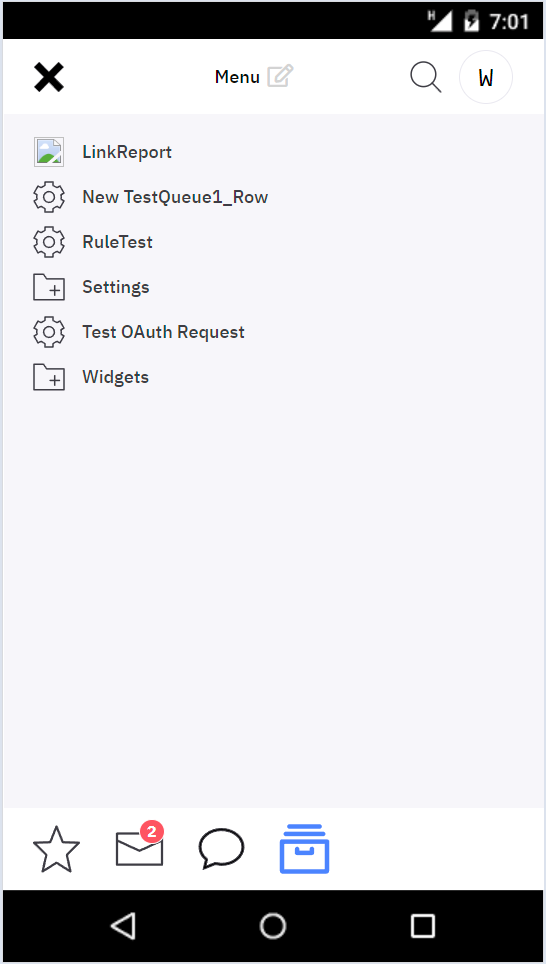
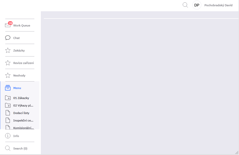
Main Menu organization: if I increase the fonts site, the menu gets bigger and more difficult to use. I suggest to allow display only one section listed and hide all others either into top hidden menu or into buttons on the bottom of menu section. Bottom icons would allow to display also red numbers of waiting tasks or chats;
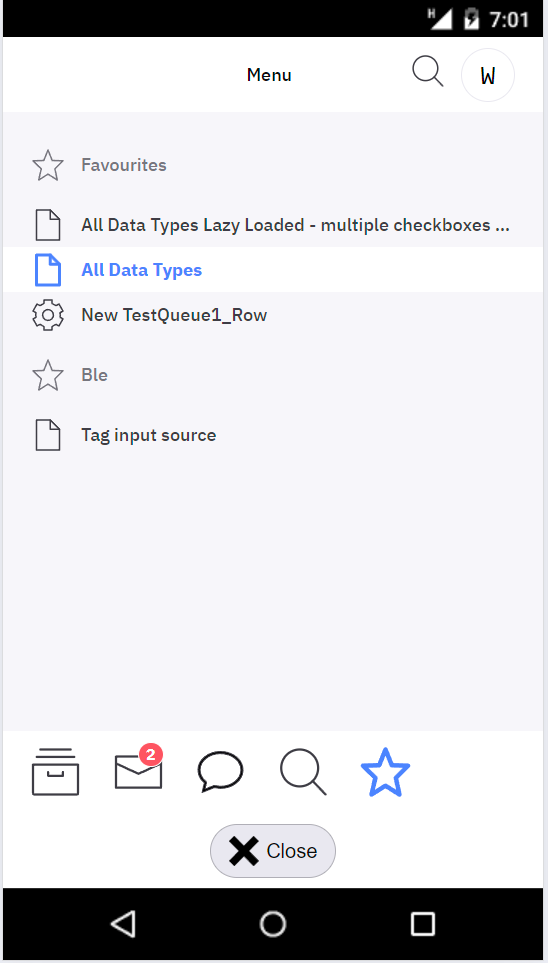
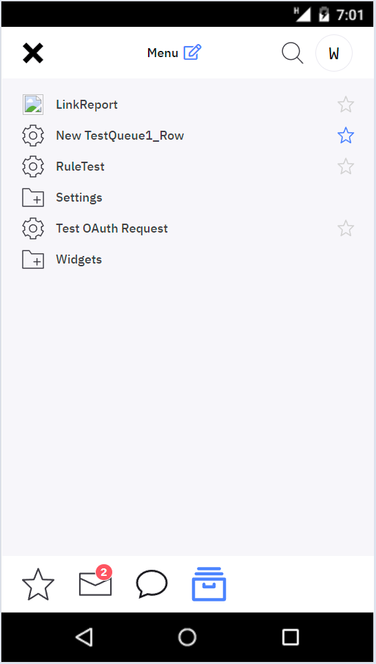
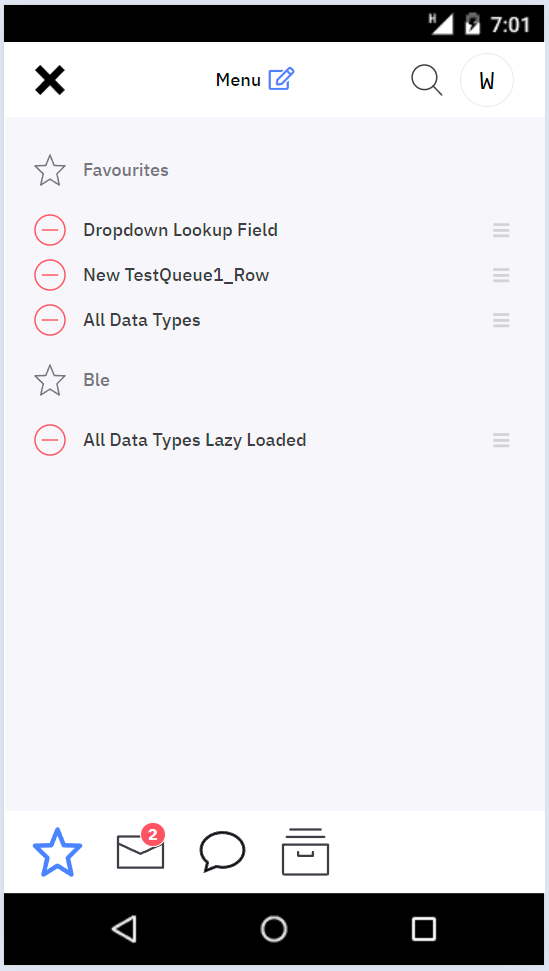
@tvavrda I’m not sure about the favorites. Are the folders sufficiently separated? Maybe their contents should be indented like in the menu…
Context menu pops up when you long tap the folders and the favorite items (so that you can remove items, add new foldes…) This does not work on Safari though. Should this work in mobile at all? A new issue shoudl be probably created if it should.
-
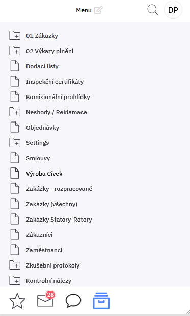
put edit button next to Menu title
-
Close button should be top left, “X” only
-
Improve search results icon
-
Hide the search results icon if no results are available
-
Sort the menu icons
I like it, I have only following comments:
-
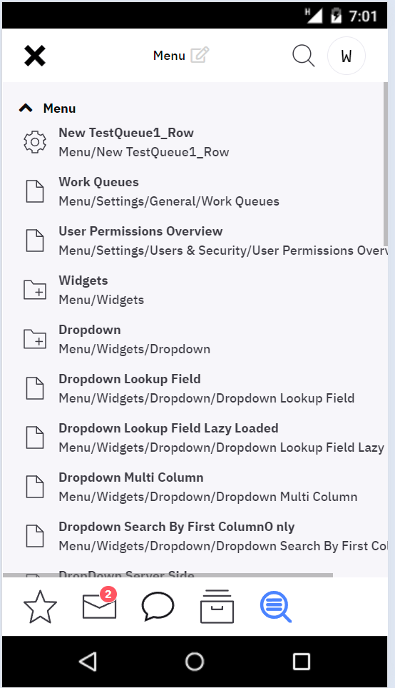
It would be great to apply this layout also when the screen height is bellow certain height. Look at this example on tablet. The menu is getting small and complicated to use.
-
Imagine it in style of mobile: it would improve navigation for user greatly.
So the “problem” is not just mobile but small height of screen complicates navigation especially when there are multiple favorites folders.
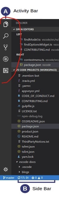
@washi already pointed out that maybe even desktop would benefit. What about doing it similarly to how e. g. VSCode does it? They call it Activity Bar.
Having the category buttons on the side would reduce the horizonal space in mobile. So I would not put it there in mobile.
We could have the buttons on the side in desktop and move them to the bottom in mobile. That would mean you have to click one extra time when accessing the bookmarks. Where would we put the pinned bookmarks? The vertical space problem on tablets would be solved though.
@tvavrda any thoughts?
The layout will stay as it is now. What has to be done next:
-
save menu state in the local storage so that the user does not have to expand the menu every time
-
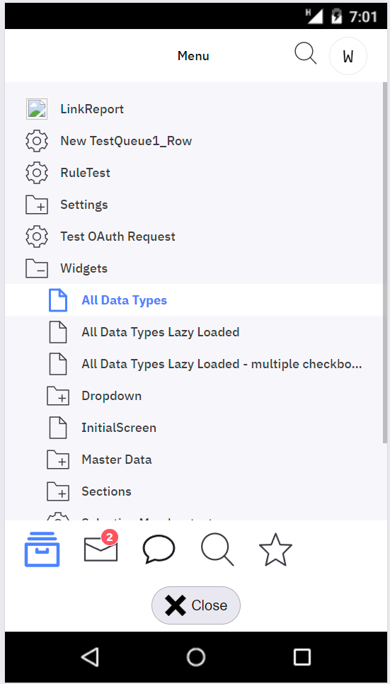
Update the page title based on the active section inside of what is now called menu (Workqueues, Search Results, Chat, Menu, Favorites )
-
Hide the edit button where no edit action is available (workqueues, chat, search results)
This topic was automatically closed 2 days after the last reply. New replies are no longer allowed.