ORIGAM UI does not handle tablets yet. This topic describes the behavior.
Tablet Detection
We should detect a tablet mainly by testing for a touch interface (and no other pointing devices) + screen width (to distinguish from a phone).
So probably
@media (hover: none){
    /* touch stuff goes here */
}
see
Menu Sidebar
We should iterate here on Reorganize menu in mobile layout and introduce the left bar (instead of the bottom bar on mobile). We should also introduce this on desktop later.
After clicking on the icon in the left bar, full screen menu should be displayed. If there are no screens open, the Favorites (if any exist) or Menu should be displayed.
Menu Content
Clicking on any sidebar icon should reveal a full screen content page, which should use Tiles for easy touch selection and full screen width usage.
Something like this:
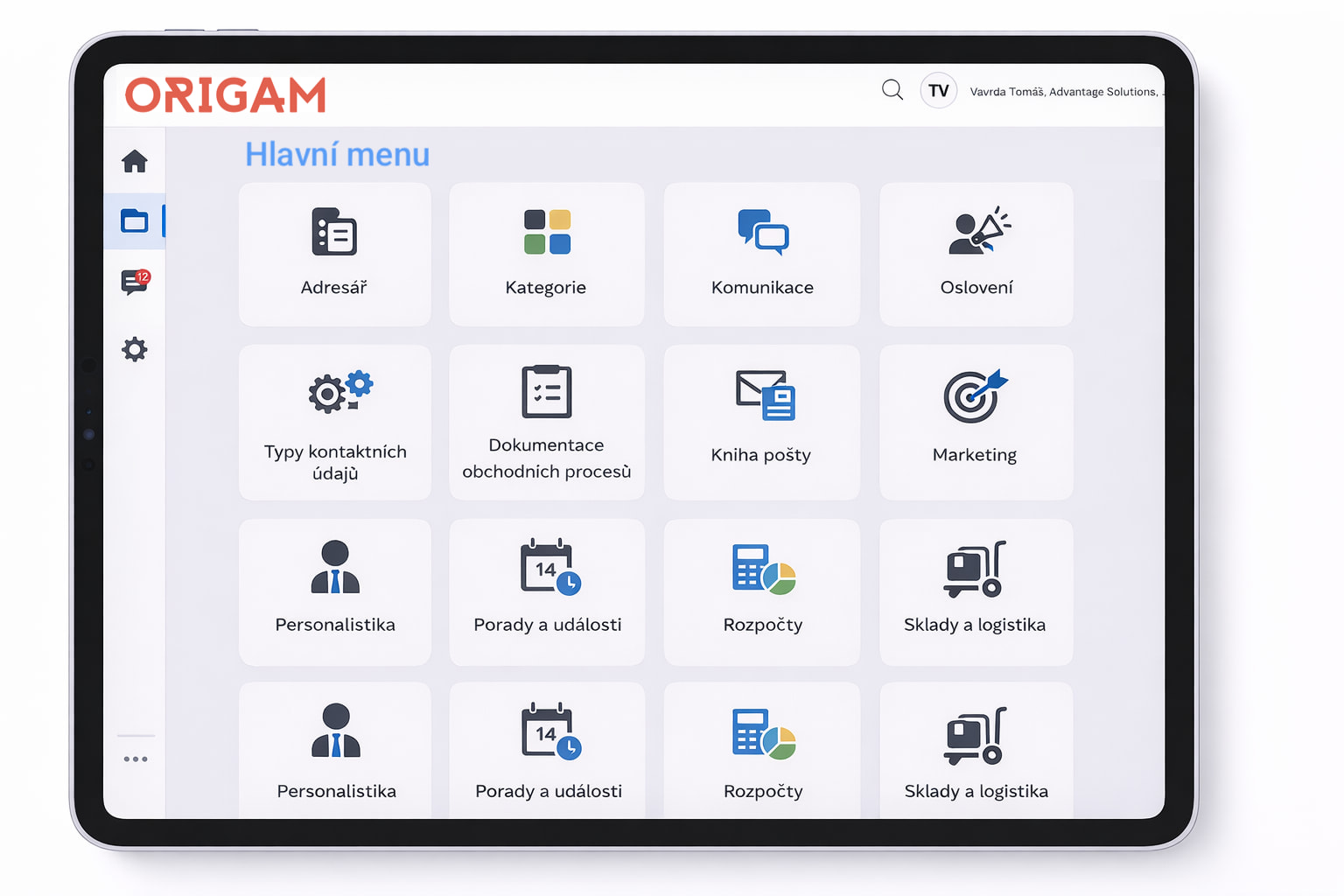
The menu tree view should behave like this:
- Top menu should display as tiles
- When clicking one of the folders a subfolder should be listed as tiles
- The current menu folders should be displayed as breadcrumbs on top of the screen
Screen Layout
Like in mobile view, only one screen section will be displayed at once and should copy the current mobile logic.
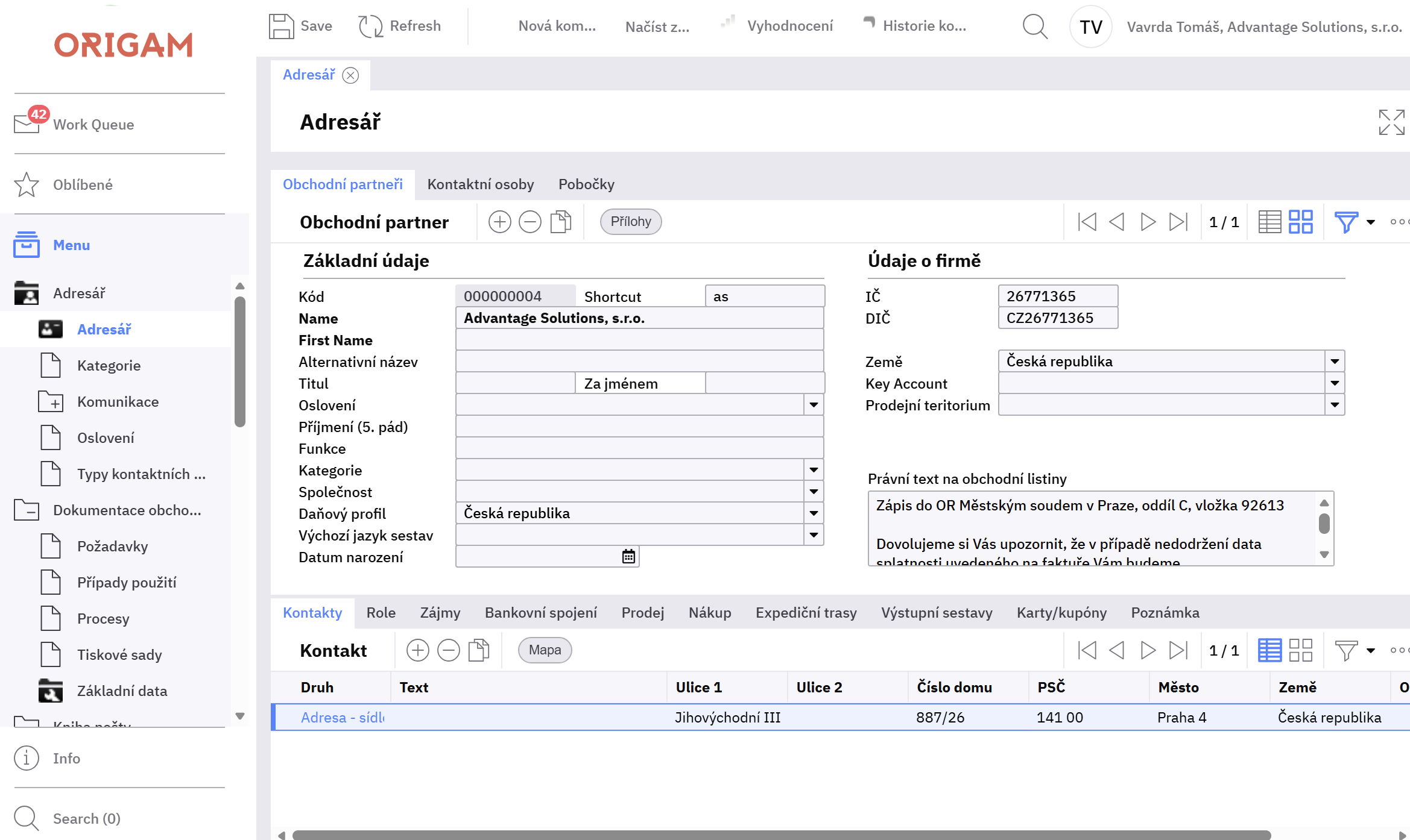
Example of the current desktop layout:
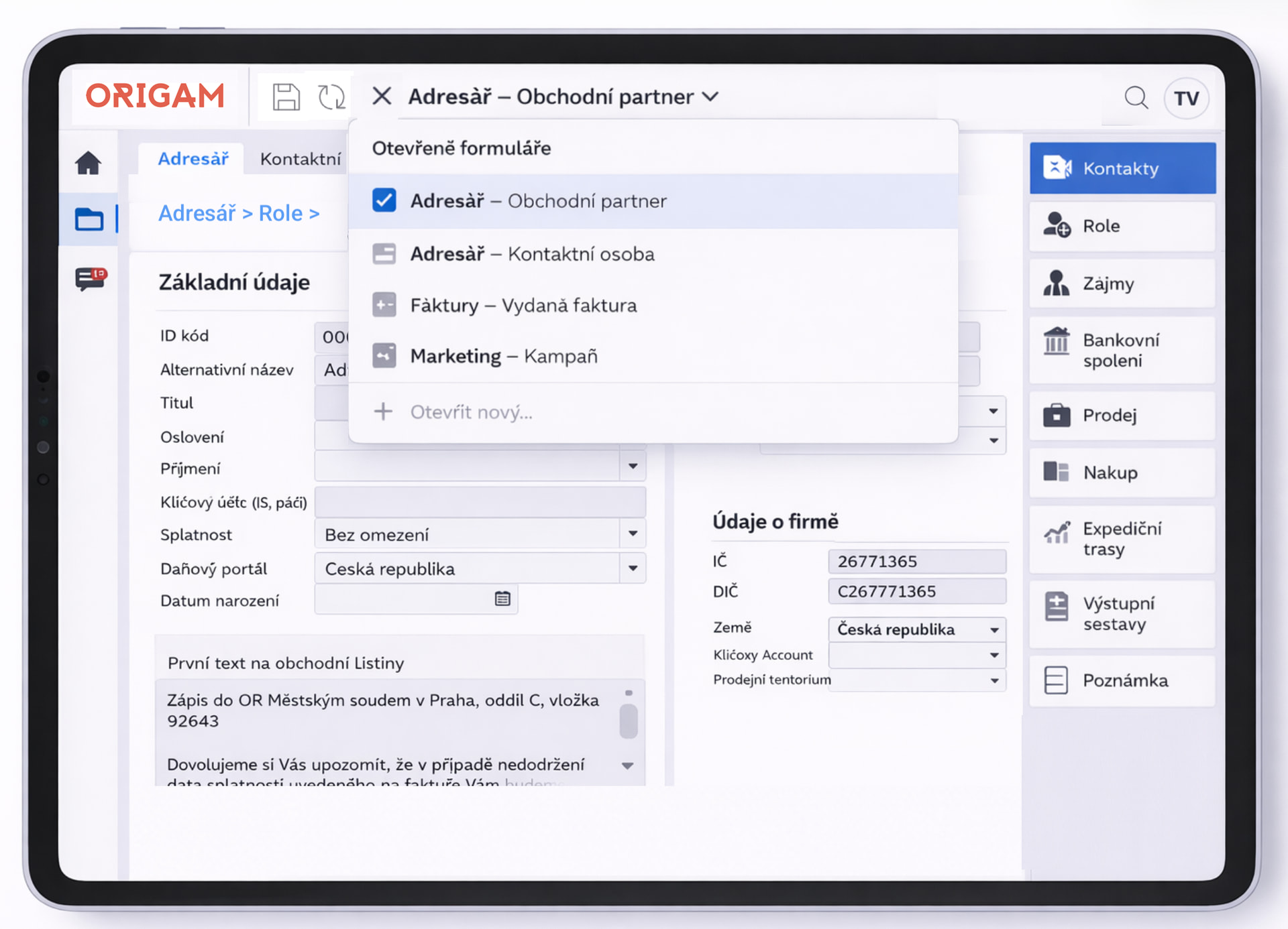
Now in the tablet mode:
Tabs
There will be a difference how tab control is interpreted. There will be two modes:
- Root level tabs
- Other tabs (e.g. inside a split panel)
Root Level Tabs
If the root element on the screen is a TabControl, we should display it as horizontal tabs on the top of the screen, like we would on desktop. This will allow easy navigation over a typical UI designed in that way.
Other Tabs
Any other tabs should be displayed in the section’s Navigation Section (see below).
Section Layout
The screen layout should iterate on the mobile view. Instead of one horizontal section there will be 3 sections (2 respectively in portrait mode).
- Data Section 1
- Data Section 2 (only in landscape)
- Navigation Section
Detail View
In detail view the Data Section 1 and 2 should display input fields just in 2 columns as there is enough horizontal space on the tablet (or just 1 in portrait mode).
Navigation section should display all the links to child views and all the action buttons.
There should be breadcrumbs on top of the screen in order to navigate back in the screen’s hierarchy, just like in the mobile view.
Other Views
Grid or map view should work as on mobile: Displayed full screen. After clicking on a row a detail view should open.
Dropdowns
They should work like on mobile but instead of full screen they should display in an overlay with some padding from every side.
Row and input height
Input box (textbox/combobox etc.) height as well as grid cell height should be 48px.