Version: 2023.1
Use Case
Our client needs to create a Protocol in certain workplace where is no computer. User is supposed to accomplish following scenario on tablet:
- User creates new Protocol
- User selects an Order from dropdown to which the protocol is assigned
- User fills in a protocol header information
- User fills in protocol rows for 3 or 4 device components
- User uses an action button Preview PDF which run Fast Reports and displays preview of the result protocol.
- User clics another action button Save PDF which creates report and saves it into the order documents for archiving
The idea is that the user will use Tablet to input data and we need a form with as bigger input boxes as possible. So Origam in classic HTML mode is not usable because on tablet the inputs are too small.
If I increase the fonts’ size of the page, the display mode is changed into mobile layout and the input are sufficiently big. But I see some troubles of using the mobile layout for the end user.
Suggestions
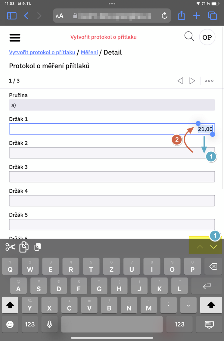
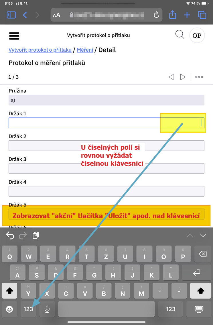
- User inputs the data but the save button is hidden under keyboard;
- When the field is type of number, system should automatically ask for number keyboard;
-
User can too easily close the form by closing icon. I offently misinterpret it as an backwards icon and I want to get back to top of the form;
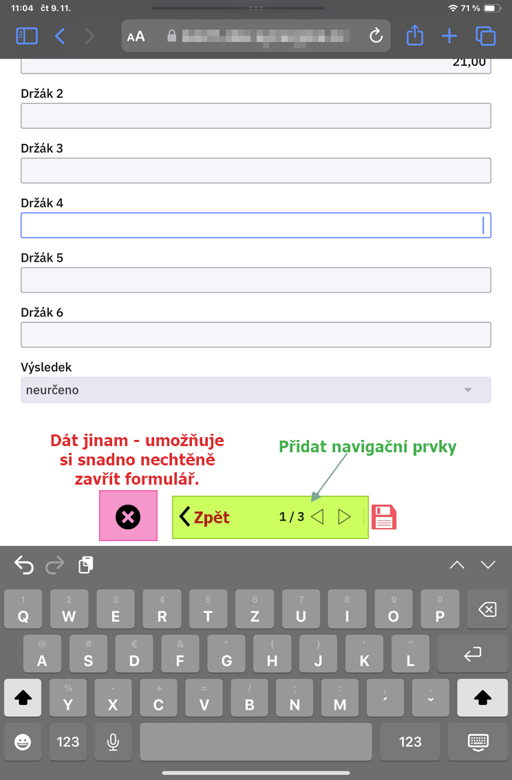
- I suggest this navigation:
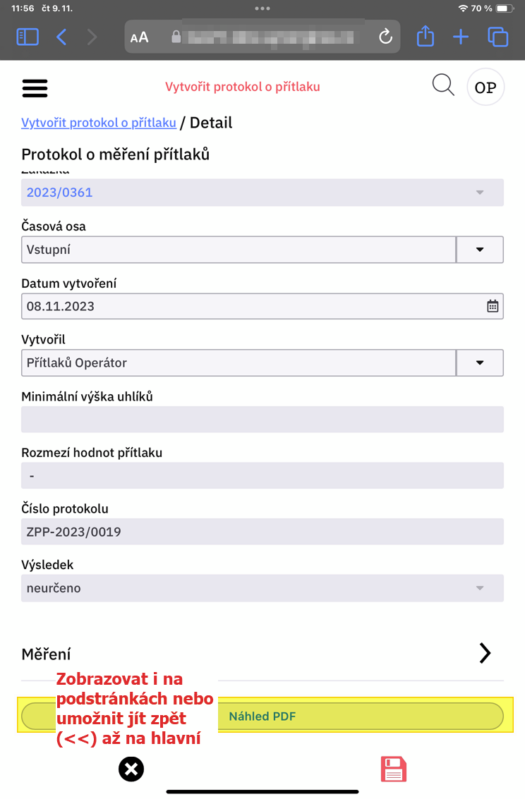
- Allow to go back to previous screen section. Breadcrumbs navigation is fine but not enough user friendly to go back just to previous section. And I would like to have it on the same place a I can see save button;
- Allow to navigate among rows
1/3 < >; - Possibly also allow to go back to main screen section (top screen section?) ? => it could allow easilly return to reach action buttons on the main screen section.
-
When there is a Rule dependant on the current field, moving next (step 1) runs rule evaluation and the focus returns back to previous (or even more previous - steps back by 2 or 3 fields) field;
-
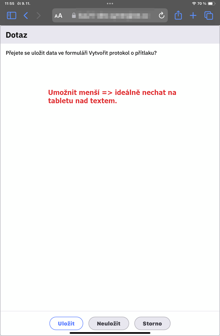
Question to save or close => make it smaller on tablet if possible. Or at least bigger text or buttons closer to text;
-
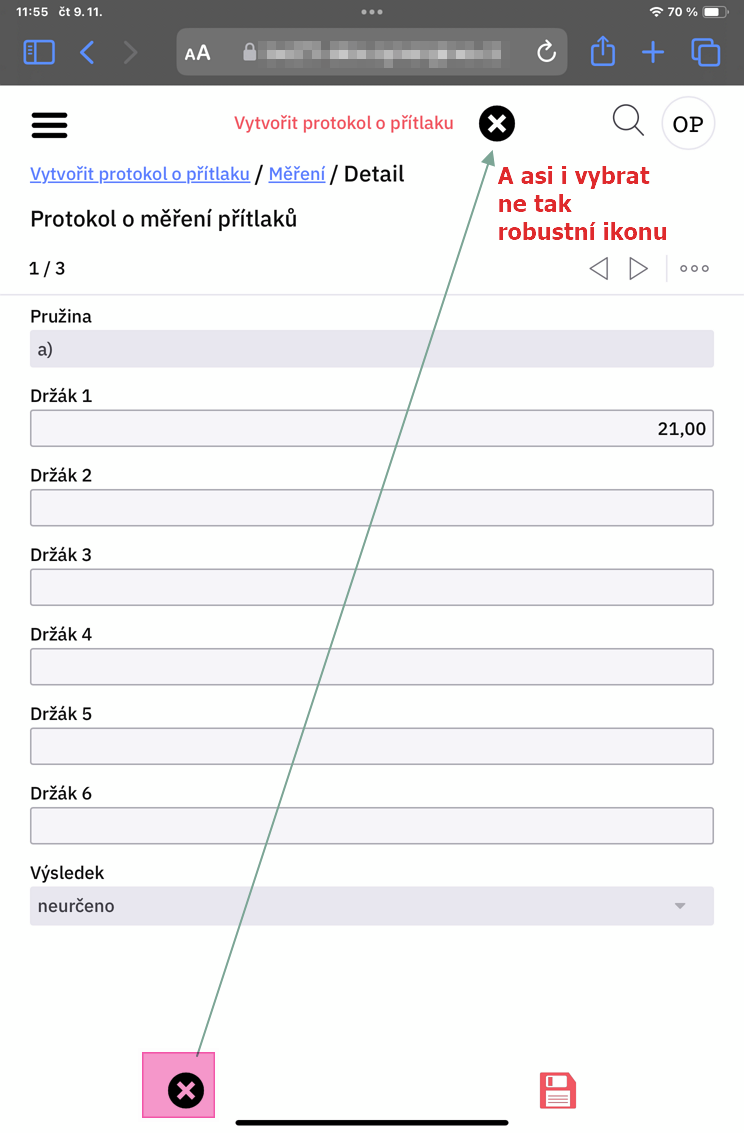
Close button - suggestion to place it on the top.
- Change icon to not so robust?
- ?Possibly always ask whether the user wants to close window?
-
Action buttons from the main screen section? Display them also on the child pages or allow user to navigate back to mail screen section;
-
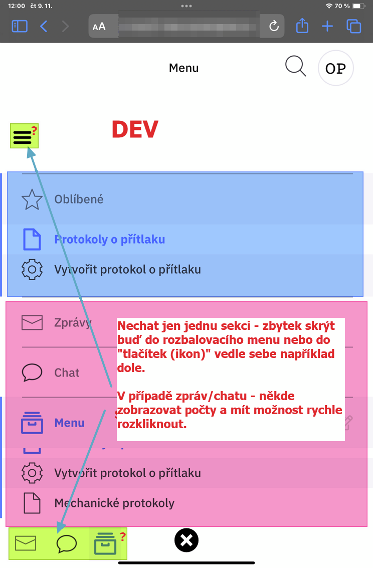
Main Menu organization: if I increase the fonts site, the menu gets bigger and more difficult to use. I suggest to allow display only one section listed and hide all others either into top hidden menu or into buttons on the bottom of menu section. Bottom icons would allow to display also red numbers of waiting tasks or chats;
-
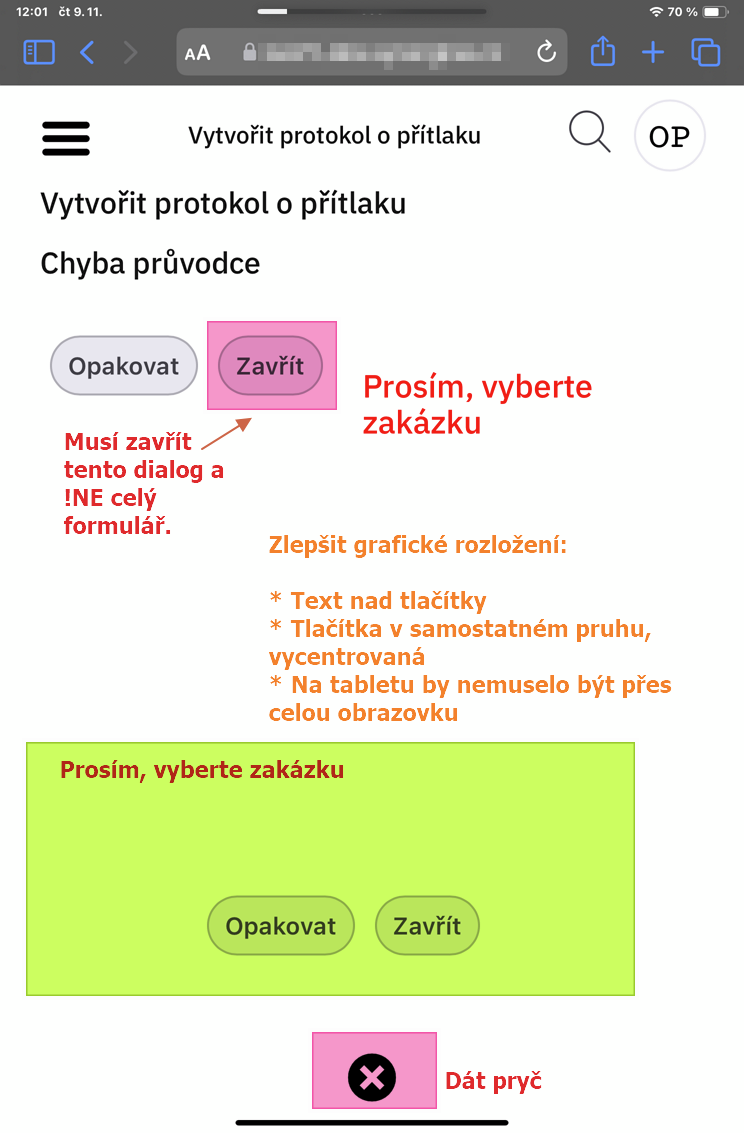
Display validation error inside workflow:
- Button Opakovat (Repeat) navigates back to form which is validated. I would expect it would have name Close or Back;
- Button Zavřít (Close) closes the whole form and gets the user back to menu. I would expect close just error box or at least rename it to Close form or place it on the different place?;
- Change layout into that text field with errors is on top, buttons are aligned below and centered;
- Close button (x) would be on the different place.
-
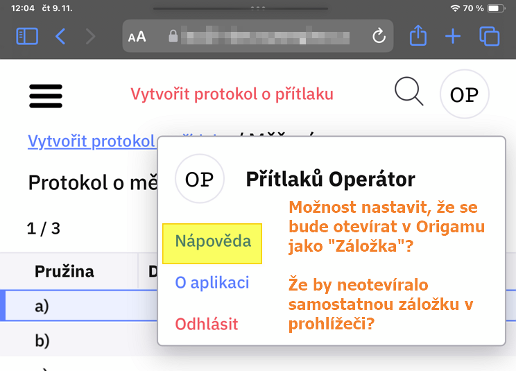
Allow to configure Nápověda (Help) link to display as a tab inside origam (new form). If I have the HTML help page, I would like to see it directly inside the origam’s layout. As it would look like completely compact.