This article shows how to fine-tune various UX/UI details in your client application by editing its model. Additional settings options will be gradually added here.
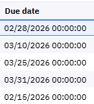
Date field format in the form grid view
If you want to switch from this
to this
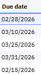
go to the screen section where the date field is located and change the Format property to Short or any other format you prefer:
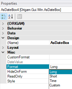
To have both the date and time without seconds, set Format property to Custom and fill CustomFormat property with the desired date format, e.g. MM/dd/yyyy HH:mm. More on custom date and time formats can be found here.
Default order of form columns
If you want to place columns in a form (both in grid view and form view) in a specific order, you need to change the TabIndex property of the fields in the screen section where they are used.
TabIndex determines the order in which you navigate through the fields in form view using the Tab key, as well as the order in which they are displayed in the grid view.
To change the order, go to your screen section. There you can either set it manually for each element in Properties, or in the editor click on the screen section and press Ctrl + Shift + T (in Microsoft Windows). White numbers with a blue background will appear in the top-left corner of each element. Click the elements in the desired order (already selected elements will change to a blue number with a white background), and then press Ctrl + Shift + T again.
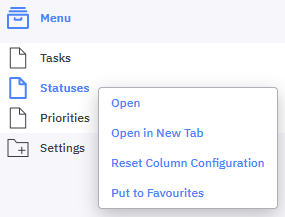
If there is any issue with the order or another problem with the columns, e.g. when you add a new column and it shows in the last place, you can reset the configuration. Right-click the screen menu item and choose Reset Column Configuration.
This configuration is saved in the database in the table OrigamPanelColumnConfig. More information about this can be found here.
UI and data controls
In this chapter, we will show how to customize various user controls, either at the screen level or at the screen section level:

Some settings you can configure both at the screen level and at the screen section level. For example, if you hide the button for the creation of new records at the screen section level, this setting will be copied every time you use this screen section in a screen. However, if you want this option enabled for one screen, you can change the setting of the screen section in that screen.
In this tutorial, we will work with the screen settings.
Record controls
In some screens that are used only for displaying data, you may need to prevent users from adding, duplicating, or deleting records.
You can find these settings under the Behavior section of the screen section (AsPanel) properties:
HideCopyButtonShowDeleteButtonShowNewButton
All these properties are of the boolean (true / false) type.
Data handling controls
You can also disable data editing and leave the screen for viewing only. This can be done either for the whole screen or only for particular fields. This configuration cannot be done at the screen level.
- Fields – set
ReadOnlyin theFieldproperties accessible from the screen section. - Screen – set
ReadOnlyAccessin theScreen Reference(menu item) properties.
Configuring data handling options is also possible using Row Level Security controls on entity level. With them, you can allow users to edit items only in a certain status, for example, or allow editing only to users with specific application roles. In these cases you work either with particular fields or entire entities.
Navigation controls and functions
-
DisableActionButtons– hides any custom action buttons if present. -
GridVisible– activates or deactivates the grid view in screens, while the form view always remains active. -
HideNavigationPanel– deactivates the entire panel with record navigation, filtering, and other functions:
Selection boxes to your workflow UI step screens
You can provide any screen (section) with default system checkboxes that can be used in UI steps in sequential workflows for example. They don’t serve for bulk actions like deleting of multiple selected items in the data grid view, they just set the Selected property in XML data to true or false which you can use in your transformations.
To add the selection box do the following:
- Open the screen
- Click on the screen section
- Go to the
Propertiestab (accessible also from the main Menu underViewor after pressingF4) - Find the
SelectionMemberproperty underMisc - Enter the field name
Selected - Save it
Now all lines in the grid view will contain a selection checkbox at the beginning:

Action buttons
In addition to the main menu, there is another way to allow users to launch screens, workflows, and other elements: action buttons.
These can be placed in the toolbar, the panel header, or the panel menu:

UI Actions
Action buttons are created at the Database Entity level as UI Actions. This means they are not defined via the target screen, workflow or else, but at the lowest possible level of the model — that is, at the database entity level.
You can choose the following action types:
- Menu Action
- Report Action
- Sequential Workflow Action
- Dropdown Action
Here, we will demonstrate how to create a Sequential Workflow Action — an action button that triggers a selected workflow.
To do this, select New / Sequential Workflow Action above your DB entity and fill in all required properties:

The following settings are also important here:
ActionType: Here are different options for what your action button can do — for example, open a form or run a workflow in the background.IsModalDialog: Instead of a form will use modal dialog window.Mode: Specifies relation between the action and data.Placement: Where the button will be placed in the screen – toolbar or panel, see above.RefreshAfterReturn: You can setup here, that after the end the screen will refresh. This can be useful, for example, when you add a new record in the workflow. If you set theRefreshCompleteFormvalue here, the entire screen will reload after the workflow runs, and you’ll see your record among the existing data without having to manually refresh the page.SaveAfterWorkflow: This is used in scenarios where a workflow action returns data to the form from which the action was initiated – it saves then the edited form. It performs the same function as when a user clicks the Save button.Rule: Rule that determines when the button is displayed and when it is not, see here.
More on action settings is here.
Screen Condition
Now that the action for the entity is ready, all that’s left is to “activate” it for a specific screen.
To do this, you need to create a new Screen Condition for your UI action and select the target screen where your action button will appear.
The model element might look like this, for example:

Parameter Mapping
In some cases, you may need your action button to pass a parameter to the workflow, such as the Id of the record for which this action was triggered.
You can create a parameter using the Parameter Mapping function on your UI action element, and it might look something like this:

Notes:
In the `Field` property, you can enter the name of the specific field you want to pass in the parameter (in this case, `Id`). You can also enter a period (“.”), which passes the entire row to the parameter, or a slash (“/”), which passes the entire row and all its child records.
The UI action with a parameter looks like this, for example:

Disabling Action buttons
About disabling of action buttons in screens you can read here.